Fund a Cause
Identity Design, UX/UI Design
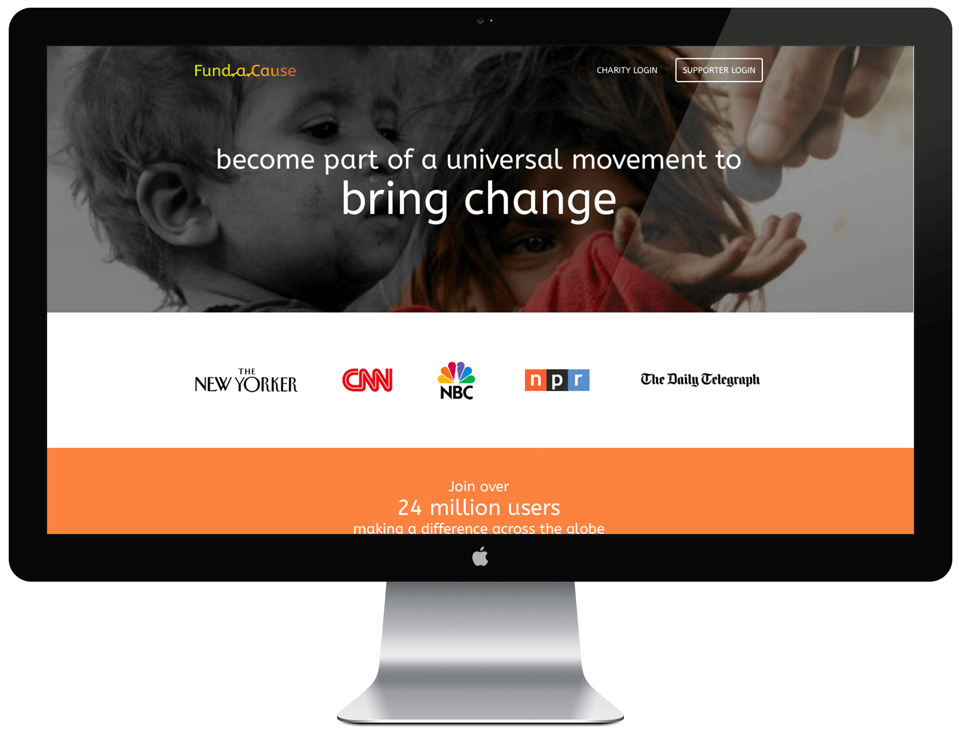
Project Summary
I designed a solution that allows charities to crowdfund donations and allows donors to select charities based on the causes they most value.
Process
I began the project by conducting competitive analysis including competitors such as JustGiving, GoFundMe and Kickstarter. This gave me direction on how to differentiate my product and brand identity.
I decided on the name Fund a Cause to give users a clear and direct understanding of the web app. Setting it apart from its competitors, the bright yet slightly muted color scheme invokes a feeling of inspiration and optimism along with professionalism. Meanwhile, the connection within the words of the logo signifies the moral connection donors form with a cause. When seen in color, this concept is further intensified—the gradual color change reflects the transformation of the donation to something actionable towards the cause. In addition to this, the typeface was carefully selected to illustrate the friendly yet professional nature of the brand. The curviness gives off a friendly vibe, yet the strict geometric structure injects a serious touch. Finally, the large x-height makes it easy to read in all sizes.

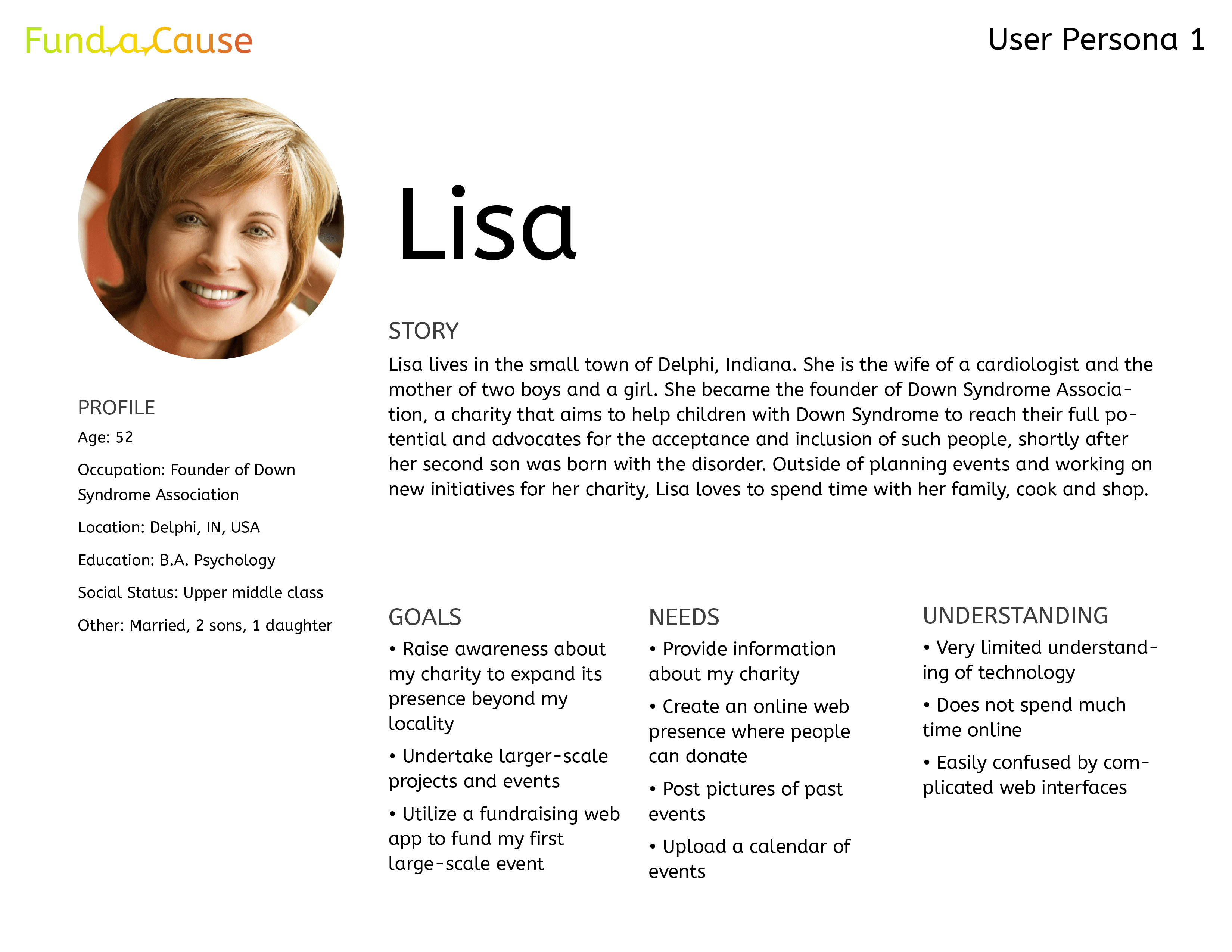
After designing the identity, I created user personas to help understand the target audience and guide design decisions.
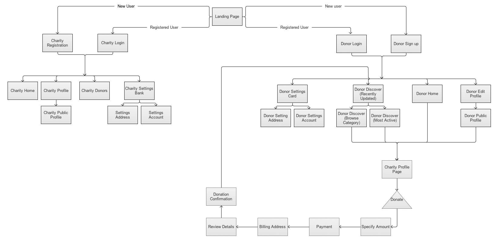
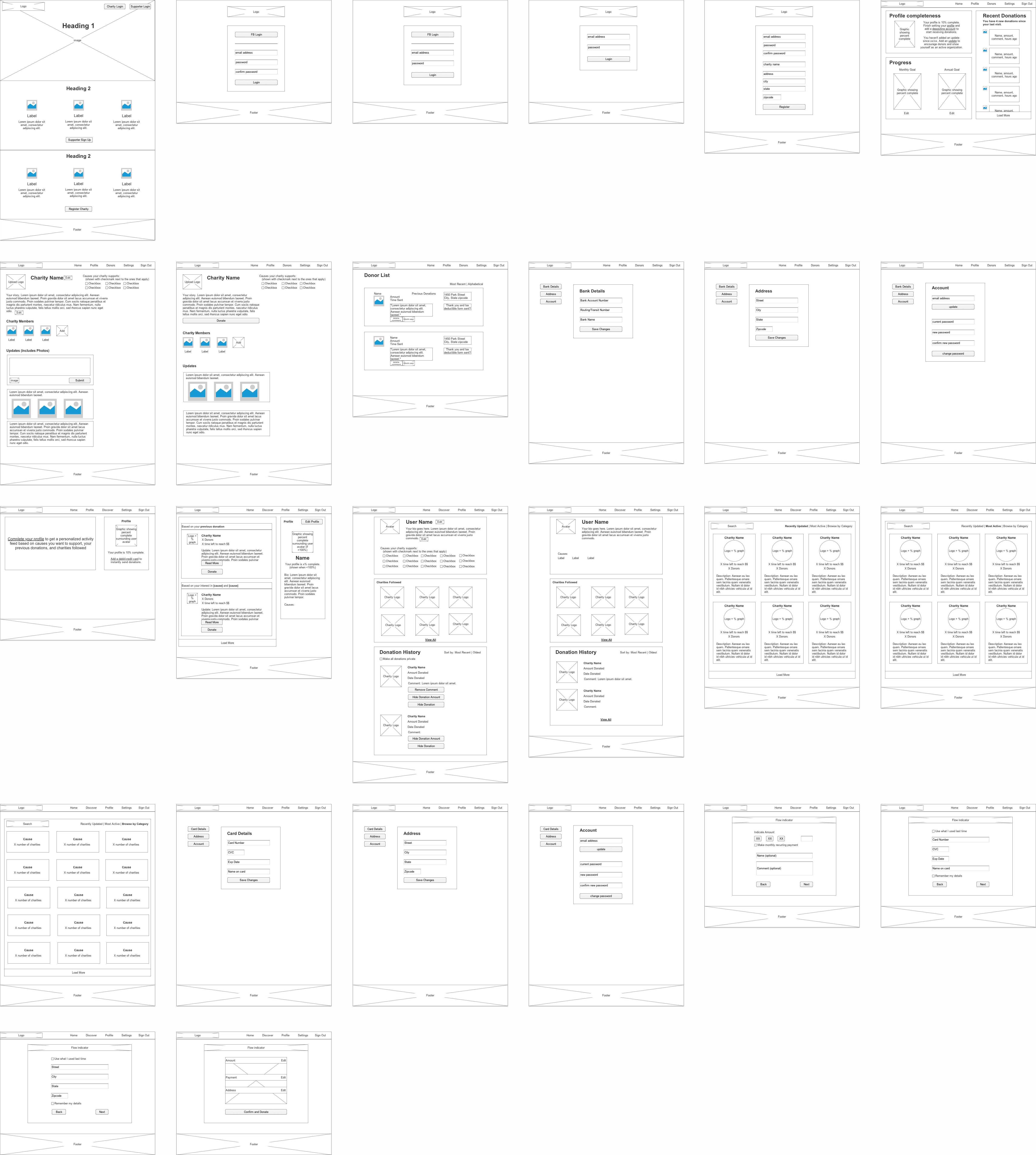
While creating the wireframes, my goal was to keep the interface simple and intuitive. To reduce the barrier to entry for new users and encourage them to complete tasks, I broke the sign up and donation processes into small chunks. After a few iterations, I moved on to high-fidelity mockups. From earlier research, I had noticed that many competitor sites either looked exciting but cluttered or clean but lacking inspiration. With the visual design of the app, I strive to strike balance between elegance, excitement, fervor, and inspiration.
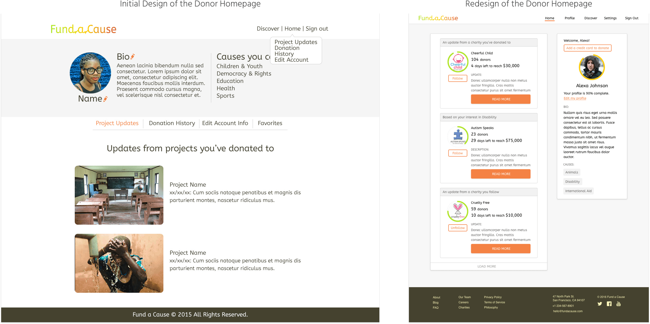
Redesign
Deeper thought about the needs of a charity and donor made me realize several things needed to be changed in my app to better serve their needs. I redesigned the structure, flow, and interface of the app to achieve this goal.
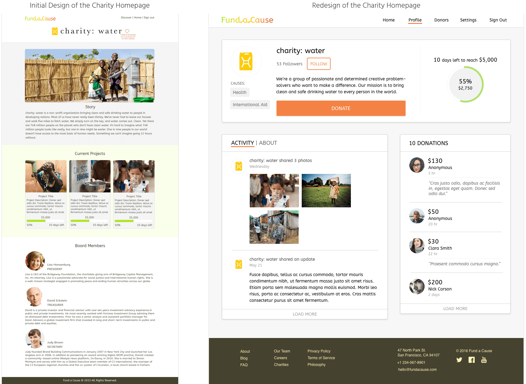
I began with simplifying things on the charity side. In the initial design, charities had a main profile page and the ability to create more pages about specific projects they wanted funding for (similar to apps like GoFundMe and Kickstarter). The problem with this structure was that charities would have to share a lot of information for each project they wanted funding for and that could get rather time consuming for an organization with limited resources. Additionally, they may not always have one specific project they are working on or enough details to share about. This led me to break things down into charity monthly and annual goals and a brief charity description section. Sharing additional information would be optional, materialized in the ability of the charity to give updates on what they are working on. The app emphasizes charities to keep sharing updates on their profile to be perceived as an active charity and attract donors. Simplifying the charity page into one page instead of multiple pages of projects also simplifies the browsing experience of the donor.
I also simplified the onboarding process. As research shows, asking too many questions up front in the registration process can cause many users to leave before completing the process. Now, once a charity or supporter registers on Fund a Cause they don’t need to immediately fill out their profile.
I changed the user interface to a card-based interface to display information in an easy-to-digest form and make it visually pleasing. I utilized subtle shadows to add depth and draw attention to important elements.
The new design offers a more personal experience for the supporter. Personal data such as causes a user cares about, donation history, and user initiated follows of specific charities allow for a more personalized user feed for supporters; whereas in the initial design there was only a list about project updates from previous donations.
