Parabol
Product (UX/UI) Design, User Research, User Testing

Project Summary
Parabol is a Software as a Service (SaaS) web application that allows distributed teams to work together efficiently. I worked as a Product Design Intern contributing to the product's UX design through creating design briefs, lo/hi-fidelity mockups, user testing, and churn analysis interviews.
The Hiring Process
As a freelance designer, I had been working on various kinds of design projects ranging from graphic design, to marketing design, to website design. I was looking for an opportunity to focus my work specifically within the field of software design. When I came across Parabol’s Design Internship job post on AngelList, I was intrigued: they make collaboration software for distributed teams; it was an opportunity to work on a 360 digital product (versus static website); the job description was written broadly enough that I had the ability to shape the internship to focus on my design interests; and they’re a fully distributed company so all of their internships are part-time, with flexible hours, so I could continue my freelance work as well.
After submitting my application materials, the hiring process began with an initial screening with Co-founder, Jordan Husney. This was followed by a second interview with Co-founder Taya Mueller. The last phase of the hiring process was called “Batting Practice”, a one-week collaborative exercise to allow both sides to get a feel for how it might be to work together. For my Batting Practice I chose to redesign Parabol’s onboarding experience. I had seven days to research, prototype, seek feedback from anyone on the team, and iterate on my design. You can view my initial design here, my final prototype here, and the design brief here.
The Internship
From the beginning, I communicated my interest to focus more on product design and hence my title became Product Design Intern. Among other duties, I made updates to the company’s marketing website on Squarespace, and I created the company’s animation guidelines detailing purpose and style, and an inventory of current and future animations. I’ll share more about my primary projects, including: notification design, third-party software integration experiment, and churn analysis.
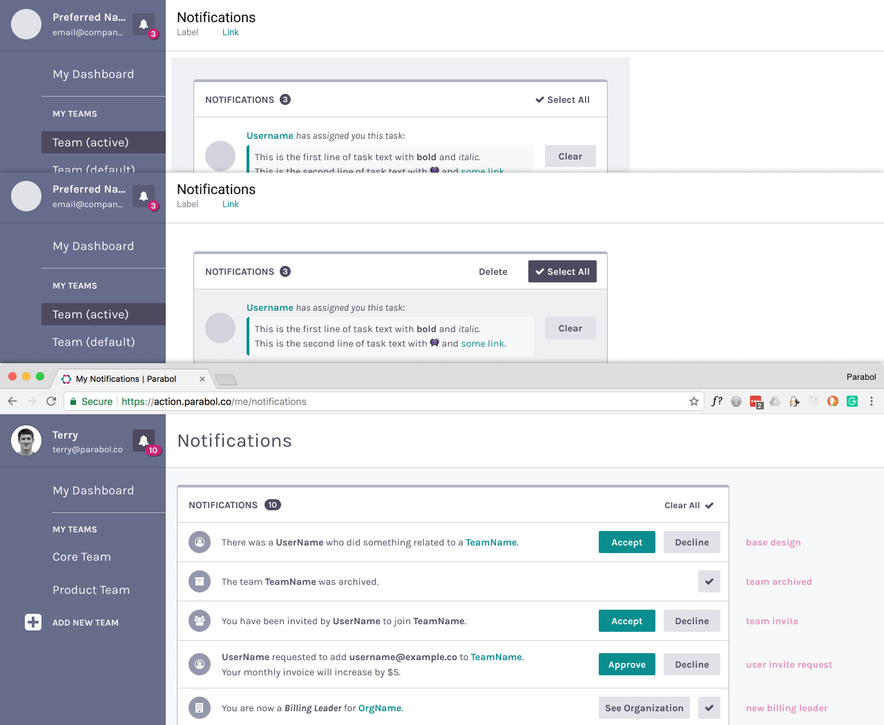
The notifications feature was one of the new features that was implemented during the time that I interned. I was deeply involved in the design of this feature right from the beginning. I began by learning about Jobs to Be Done (JTBD) of different use cases for when a user would need to receive a notification to accomplish a certain task. I contributed to the feature design brief by writing job stories. I also created a detailed inventory of all online and offline notifications including notification type, message, action, and the JTBD. With this information, I was able to see the inconsistencies in Parabol’s current notification system and address those issues as we further developed it. I collaborated on the notification design high-fidelity mockups in Figma with Full-stack Architect Terry Acker. After the mockups were created, I assisted in user testing of the prototype before implementation. The insights gained from the user testing allowed us to iterate on the design before going into implementation.

I initiated an experiment to test if there was interest among our users (churned and potential) for a third-party software integration to Parabol. The company’s current focus has been on the beginning of the funnel, and I wanted to know if we could get more conversions to the product with this integration feature. I decided that a survey was the best tool for this situation because we wanted to gain a general understanding of that specific software usage among our population of interest. I drafted the survey with Jordan in such a way as to understand respondents’ usage of the third-party software and lead them to understand the value proposition of Parabol. After the survey closed, I analyzed the responses and reported back to the team on my findings. My findings informed the next steps on whether or not the team would proceed to implement this integration feature.
One of the main things I focused on during the internship was churn analysis. We were noticing a lot of users who began using the product but didn’t return, and we wanted to find out why. In my first attempt, I targeted only “high-value churners” (people who had previously been heavy users, but had not returned in the past thirty days). I emailed each of these “high value churners”, asking them to share their experiences with Parabol. This attempt was unsuccessful as no one responded.
For my second attempt, the team agreed to my recommendation to budget for some incentives to entice participants. After co-developing the research parameters with Taya, I created a two-part survey, this time targeting all inactive users. The first phase was to secure Qualified Respondents based on our predetermined qualifications for a “target user”. I then approached a segment of these users for a phone interview to gain further insights. These data gathered from the surveys and interviews revealed some new information and validated some of our previous concerns. After analyzing these data, I documented the key takeaways and shared it with the team. The team is planning to carry forward several of my recommendations.
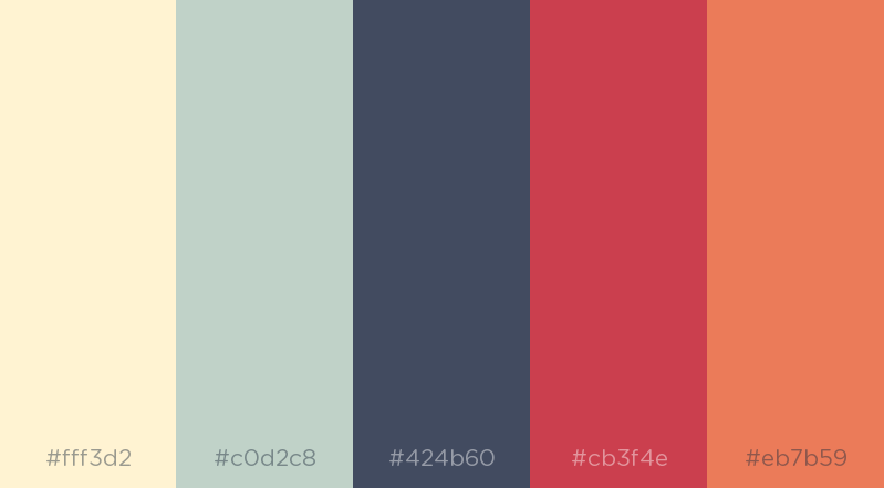
I also worked on a few other projects. Parabol launched a new website this year and we wanted to optimize the site for increased conversions (signups for the product). I created a proposal of possible A/B tests we could run on the website, including testing CTA copy, main navigation tweaking, and demonstration video placement. After gaining feedback from the team, I implemented four of five A/B test proposals using Google Optimize. I also participated in a one-week design sprint during which I created and shared three potential color palettes for the product’s new branding initiative. One of my palettes was chosen as a finalist out of nine, including those submitted by senior designers on the team.

Finally, another great opportunity I got to take part in during the internship was the company’s in-person quarterly strategy retreat known as “S.P.A.”. Over the course of two days we did intense strategy workshopping to prioritize our work for the next three months. You can read more about my S.P.A. experience in this blog post.
What I Learned
Interning at Parabol was my first exposure to working on a product design team. What really excited me about Parabol from the start was how much attention everyone on the team gave to user experience from the beginning of the product cycle. Even the founders and engineers play a key role in the initial design phase of the product and everyone gives UX priority. It was a great opportunity to work with a team of incredibly talented designers, engineers, and founders.
Interning at Parabol also gave me the opportunity to do hands-on user research, conduct interviews, initiate experiments, and advance my skills in product design. I have matured quite a bit as a designer during this season, and I have a better sense of where I am headed with my next design role. After having taken part in the whole product cycle — from research, to design to implementation — I realize that my strengths and interests are in conducting user testing/research and converting those findings into actionable insights in the form of job stories, user flows, wireframes, mockups and prototypes. I look forward to applying these skills at my next job.