Kelvin
Identity Design, UX/UI Design, Design Implementation
Project Summary
Kelvin is a startup that has created a web application/extension that allows users to collectively measure things online, and it also allows users to communicate “on” websites. I worked as a design consultant to form the company and product’s design methodology. I created business cards for the company as well as designed and implemented the user interface of the web app.
Process
My first step was to get a better understanding of the product, the goals of the founders and the target audience. I began by asking these questions:
- If Kelvin were a person, what kind of a personality would it have?
- What emotional connections do you want to users to make when they use Kelvin?
- What words would you associate with Kelvin?
- Who are your first early adopters?
With this information I created a basic style tile that evolved to the one you see below. The constraints I was working with included the logo design and the primary color.
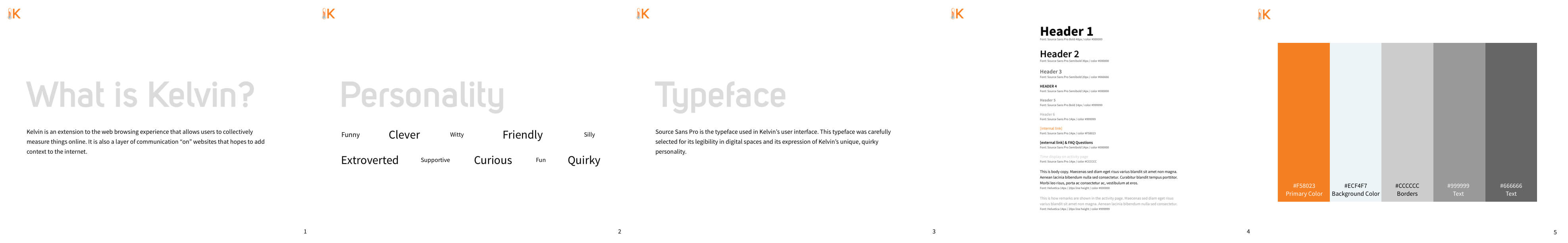
I initially chose Helvetica as the typeface of the web app because of its prevalent use. My research showed me that leading social networking sites such as Facebook and Twitter opt for simpler typefaces because most of their content is user-generated. However, more exploration of Helvetica made me realize its lack of legibility on screen displays and I replaced it with Source Sans Pro. I selected Source Sans Pro for its legibility in large and small sizes as well as the uniqueness in shape and curve to reflect Kelvin’s quirky personality.
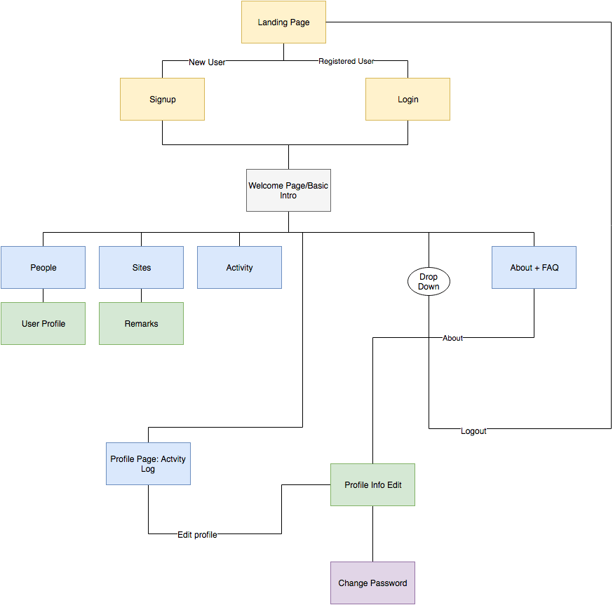
The web app was already partially coded during the time I was brought into the project. I created a sitemap of the current state of the app to see if any changes could be made to the structure to make it easier to use. I took this opportunity to suggest some changes in the flow of the app to make it more intuitive for the user.
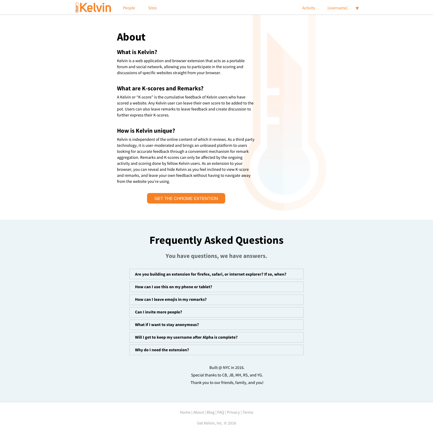
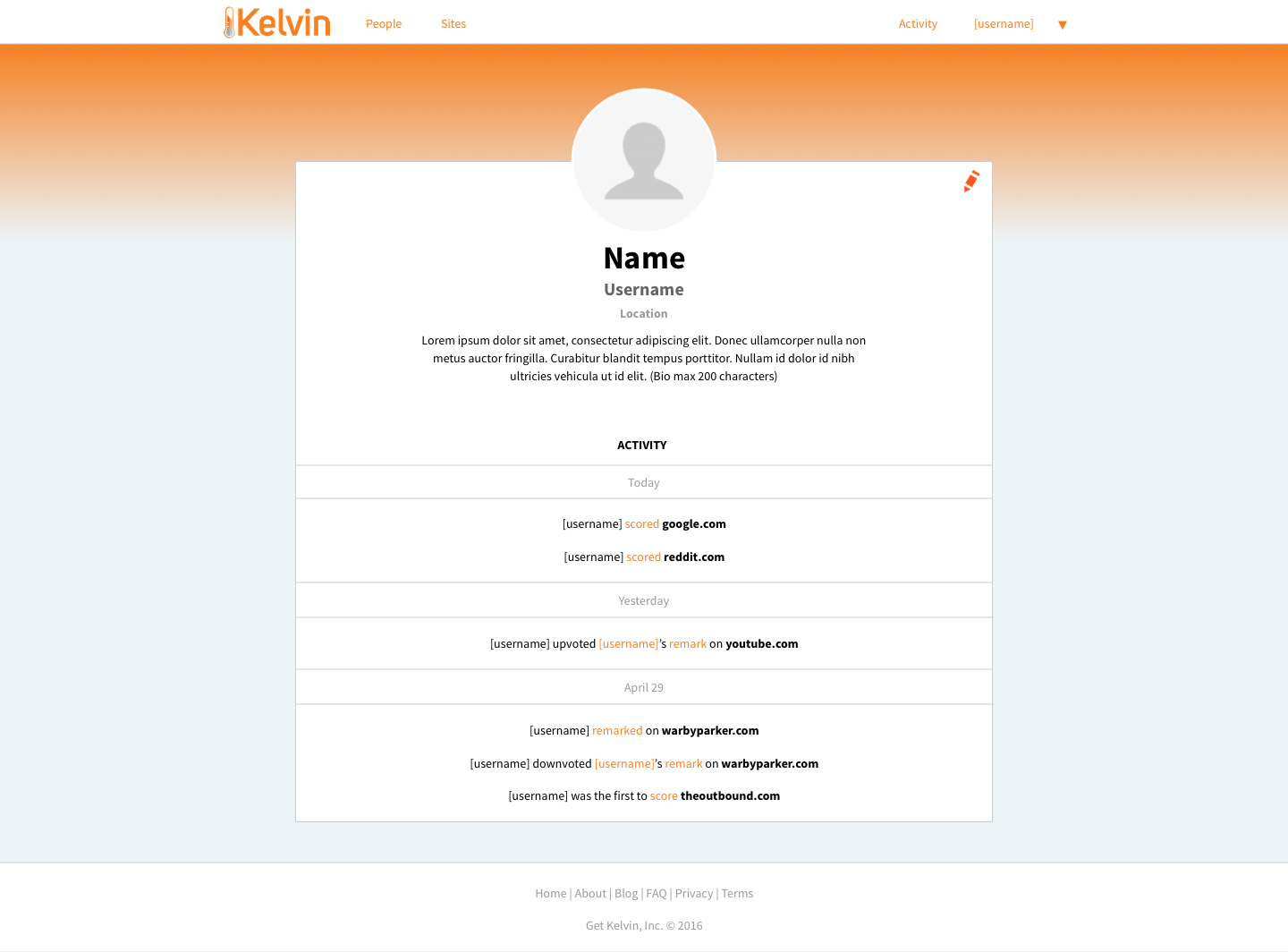
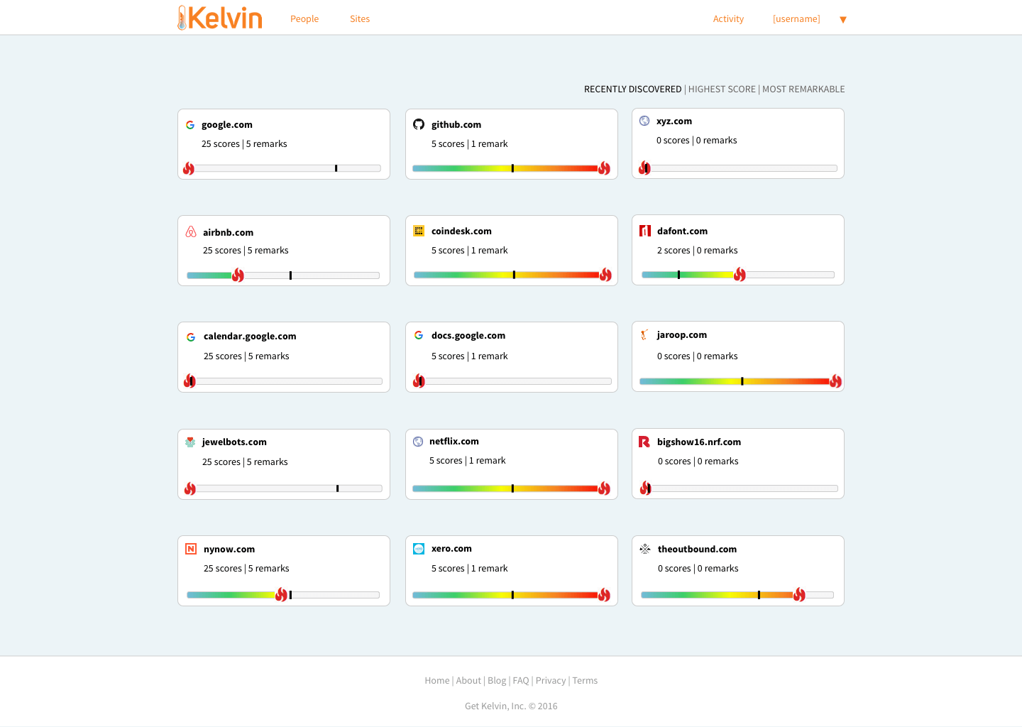
I designed the user interface to create a light and friendly feel, inviting users into the app. The primary orange color is strategically used to bring to attention areas of emphasis such as links and buttons. I opted for a light blue background in the app with white headers and footers to neutralize the brightness of the primary color. Designing the activity feed page and user profile from a blank canvas was an opportunity for me to create an intuitive user interface. I also did the coding to implement the design in the app.
My design of the activity page was inspired by Facebook, and this also came with the added advantage of using a system most of our users are already familiar with.
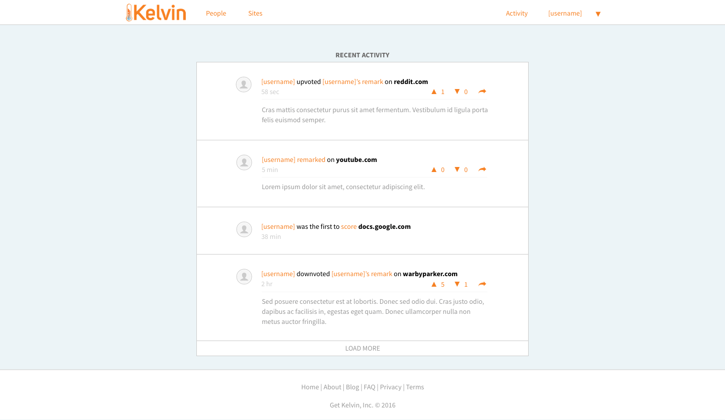
All in-app links are indicated by the app's primary color. For example, Clicking/tapping on a username will take the user to that person's profile and "remark(ed)"/"score(d)" will take a user to the remark page of that website. On the other hand, external links are bolded.
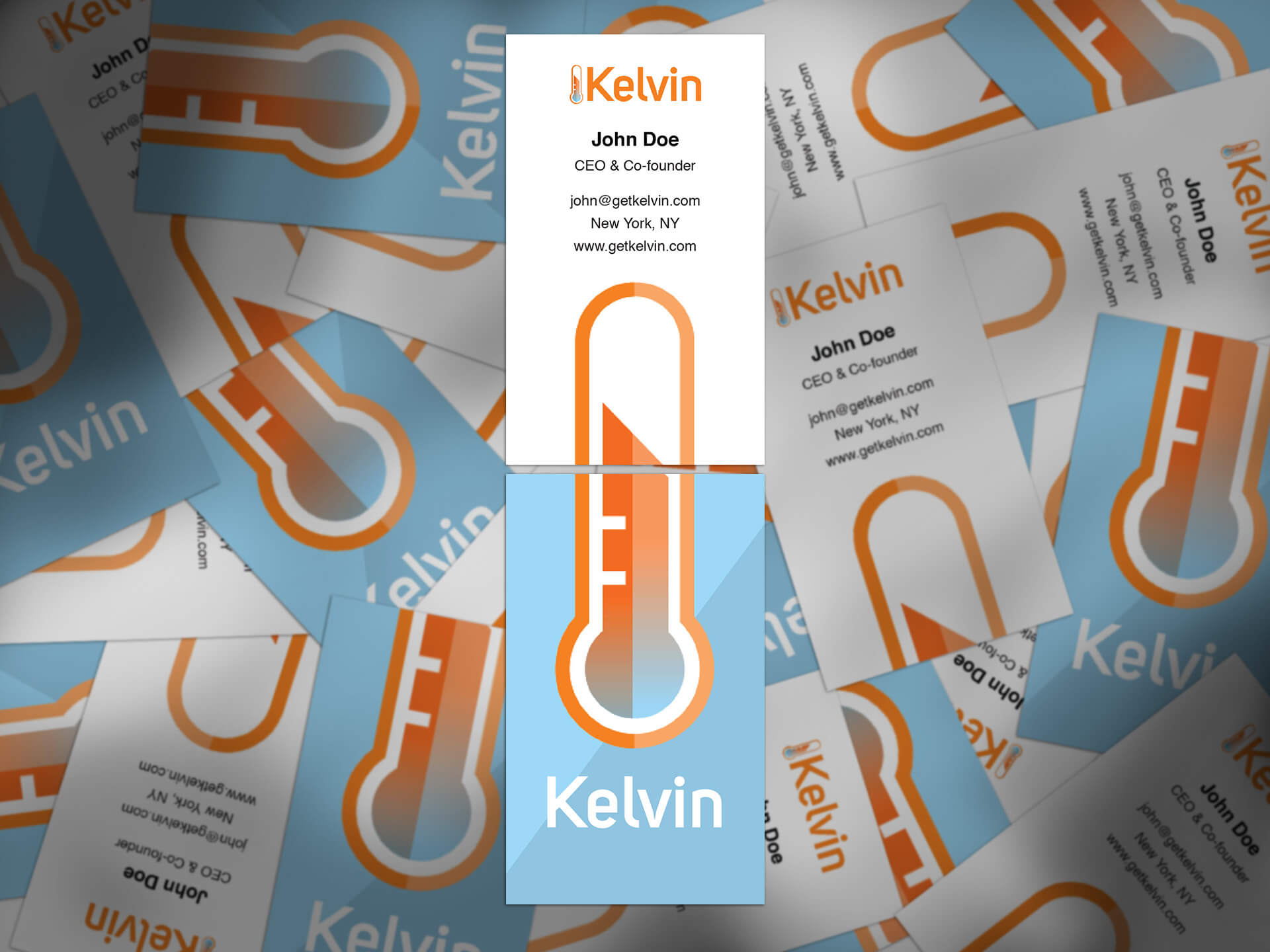
Additionally, I designed the business cards for the company. After brainstorming different ideas and gathering feedback from the founders, several iterations of the design evolved to the one you see below. At least two cards are needed for someone to visualize the whole thermometer that serves to be Kelvin’s icon. This is a subtle symbolization of Kelvin’s goal of bringing users together to create meaningful content and the importance of the combined efforts from both founders to create Kelvin.
My personal interest in product strategy and the desire to create a truly user-centric product led me to create a survey to gain a deeper understanding of Kelvin’s users and gather more qualitative data. You can view the survey here, which also contains the suggestion of conducting usability testing to spot any issues on the ease of use.