Hello Hearing
iOS & Android Product Design (Research, UX/UI Design)
Project Summary
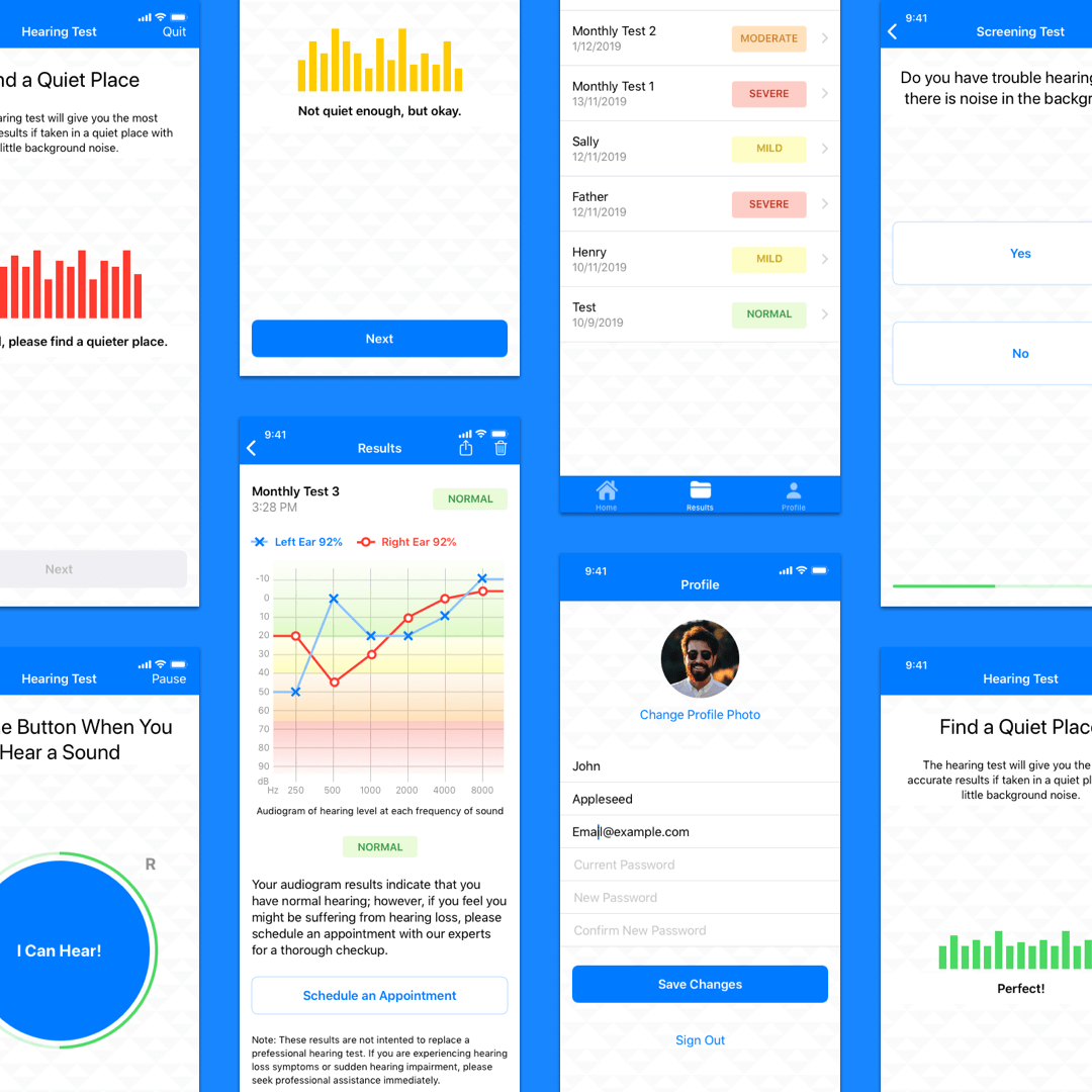
Hello Hearing is a company that conducts hearing assessments and supplies hearing aids to customers. I was hired to create a screening tool for potential customers to help them determine whether they need to see an audiologist. I worked with the client to understand their needs, translate them into project requirements, research the market/industry, understand the target audience, and determine app functionality in order to create functional prototypes for both iOS and Android devices.
Process
I began by asking questions to understand the nature of the client’s business and assess their needs. My client was a private hearing aid dispensing company that wanted to reach out to potential customers by creating a screening tool they could use from the comfort of their homes. The tool would allow customers to determine whether they need to visit a specialist with my client for a thorough hearing checkup. The solution I designed for them is an iOS and Android mobile application that users can access from any location.
My next step was to gain a better understanding of the market/industry and target audience. I researched how hearing tests are generally conducted and the specifics of audiograms. I looked into the different types of hearing tests available online on websites as well as mobile applications. I conducted first-hand research by trying out the applications, noting the user flow and pros/cons. Mimi Test, Sound Check, Hearing Test, and uHear are a few of the applications I researched. I also researched third-party critiques by hearing specialists and gathered user feedback of existing applications. This research also informed me in understanding my users. I created user personas that embody their needs and allowed me to empathize with them.

I determined the specifics of the application functionality by utilizing the Job Story method to flesh out details of user needs in different circumstances. Using my research and user personas as a guide, I designed the user experience.

After creating wireframes of the screens I moved onto to high-fidelity mockups of both iOS and Android versions of the application.
Design Rationale
Below are some of the highlights of my research and the solutions I included in my design.
PROBLEM: The hearing test results of existing applications were either difficult to interpret, inaccurate, or unconventional.
SOLUTION: Users wanted easy-to-interpret results that were also detailed and professional, similar to what they would receive from an audiologist. I included a conventional audiogram (red o’s = right ear; blue x’s = left ear). To help users interpret their results, I added a color gradient within the audiogram.
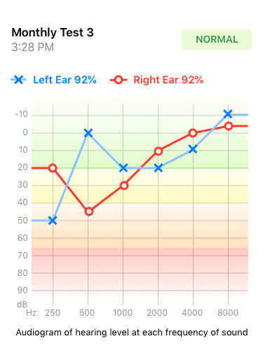
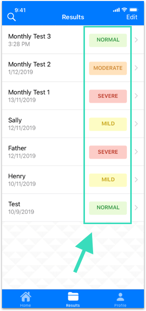
Additionally, I included a one-word summary of the result for users to quickly make sense of the information. It is also visible from the list view to help users quickly locate tests they may want to revisit.
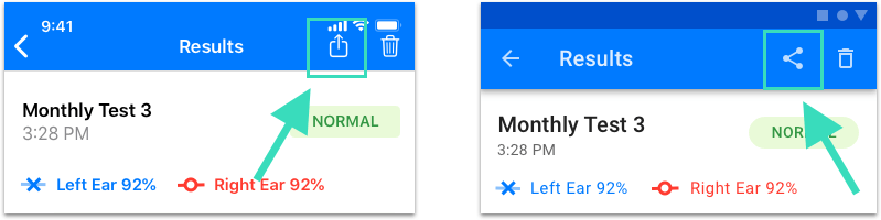
PROBLEM: Users could not share their results easily in many applications. Sometimes they had to take screenshots or email it to themselves to actually view the results.
SOLUTION: In my design, users can conveniently share their results using the familiar share icon in iOS and Android.
PROBLEM: There is no local storage of past tests taken on existing applications.
SOLUTION: In my design, once users create an account on the application they are able to store tests and access them later. One of the main navigation tabs is dedicated to saved test results.

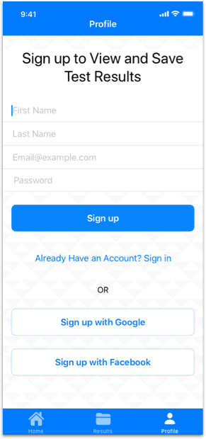
PROBLEM: Applications ask for too much personal information during the onboarding stage.
SOLUTION: Users do not have to create an account to take the hearing tests; however, they are encouraged to create an account if they would like to save their results on the app. Additionally, sign up is very simple and requests minimal information. Users can also sign up using popular applications such as Google and Facebook.
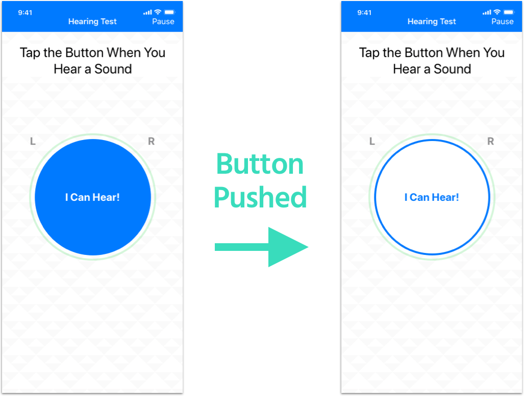
PROBLEM:While taking the hearing test in some applications, it was not very clear if the button was pressed.
SOLUTION: When the button is pressed during the hearing test, the change in color clearly indicates the change in state to users.
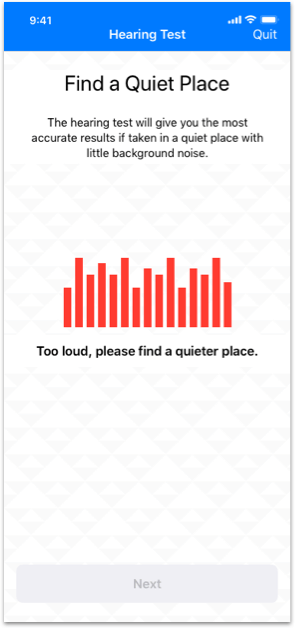
Mimi Hearing Test was the highest-rated by users and contained some positive aspects that I included in my design. The app periodically checks background noise levels and pauses if it is too loud.
Another aspect I found on existing applications that was beneficial was pausing the test when the user does not respond for long periods of time. After about ten seconds of inactivity, the test automatically pauses and the user sees the screen below.

I kept the design consistent across iOS and Android to give users a consistent experience across devices. The differences stemmed from Apple’s Human Interface Guidelines and Google’s Material Design guidelines (icons, input fields, button styles, typeface).
Some of the applications I tested utilized a continuous beep that required users to keep the button pressed until the user stopped hearing the sound. After some quick user testing I concluded it was more intuitive for users to press the button while hearing the sound, and I utilized the standard three-beep hearing test.
Throughout the application I included clear, actionable next-steps. Users are able to directly call to schedule an appointment through the app. I include this button on the home page as well as in the hearing test results page. Additionally, I created blank states that encourages users to take action. For example, when user does not have any saved tests, the blank state of the results tab leads them to take a hearing test.
As I was designing more for an older audience, I opted for a clean user-interface design with large font sizes. I utilized a clear, simple, and accessible color palette to avoid unnecessary strain on the eyes.