Paycrave
iOS UX/UI Design, Responsive Website Design & Development
Project Summary
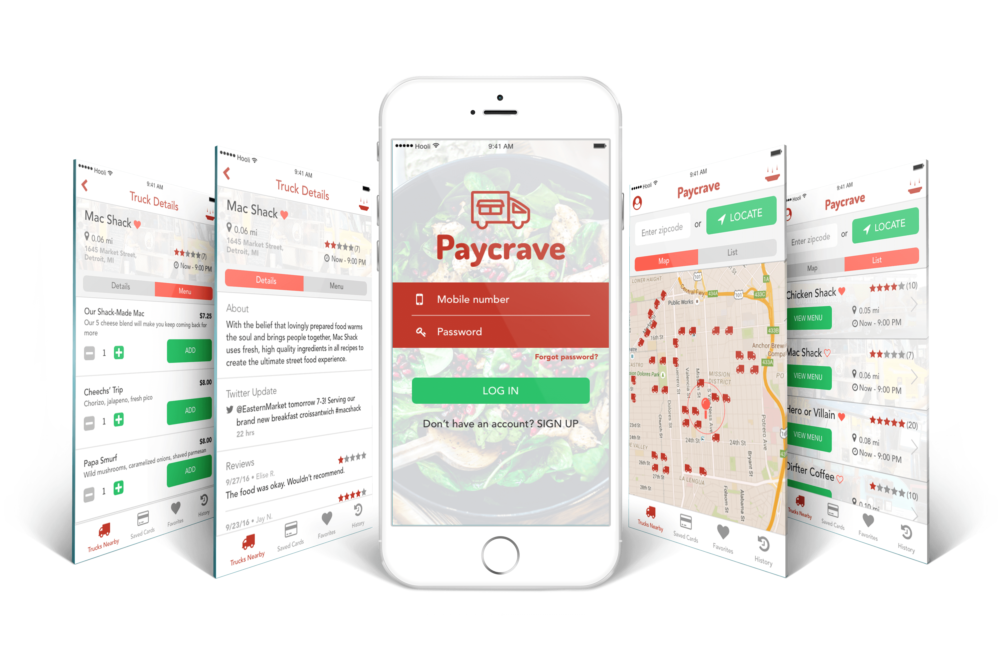
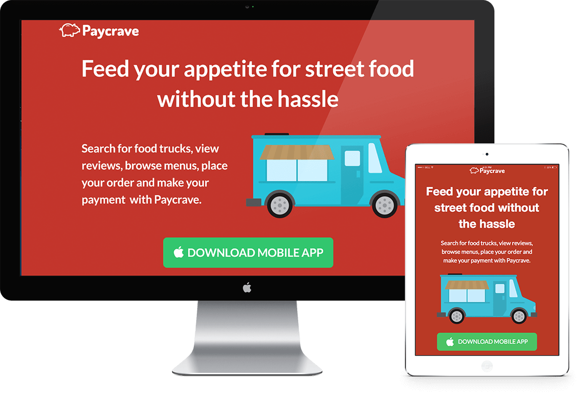
There are several food ordering mobile applications; however, a well-designed solution pertaining to food trucks does not currently exist. I designed Paycrave to help users locate food trucks, view menus, select food items for purchase, and make their payment. Users can also view their previous transactions and provide feedback for each food truck they've purchased from. I then created a responsive website to showcase the mobile app and share its benefits in an engaging way.
Process
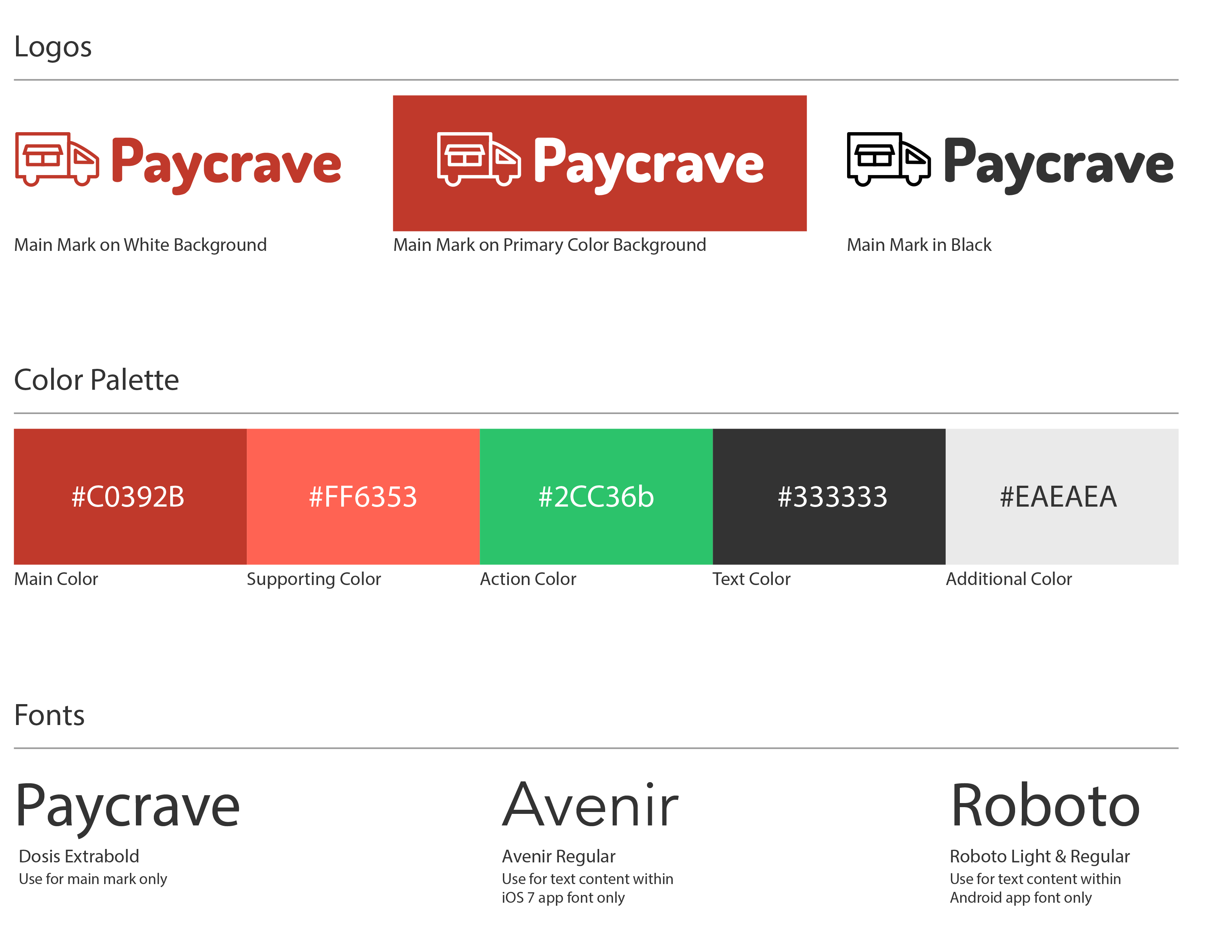
The name and brand identity were already created for Paycrave, giving me the opportunity to practice designing under certain constraints. I associated the words “bold” and “straightforward” with the app and gave it a voice to match its identity.
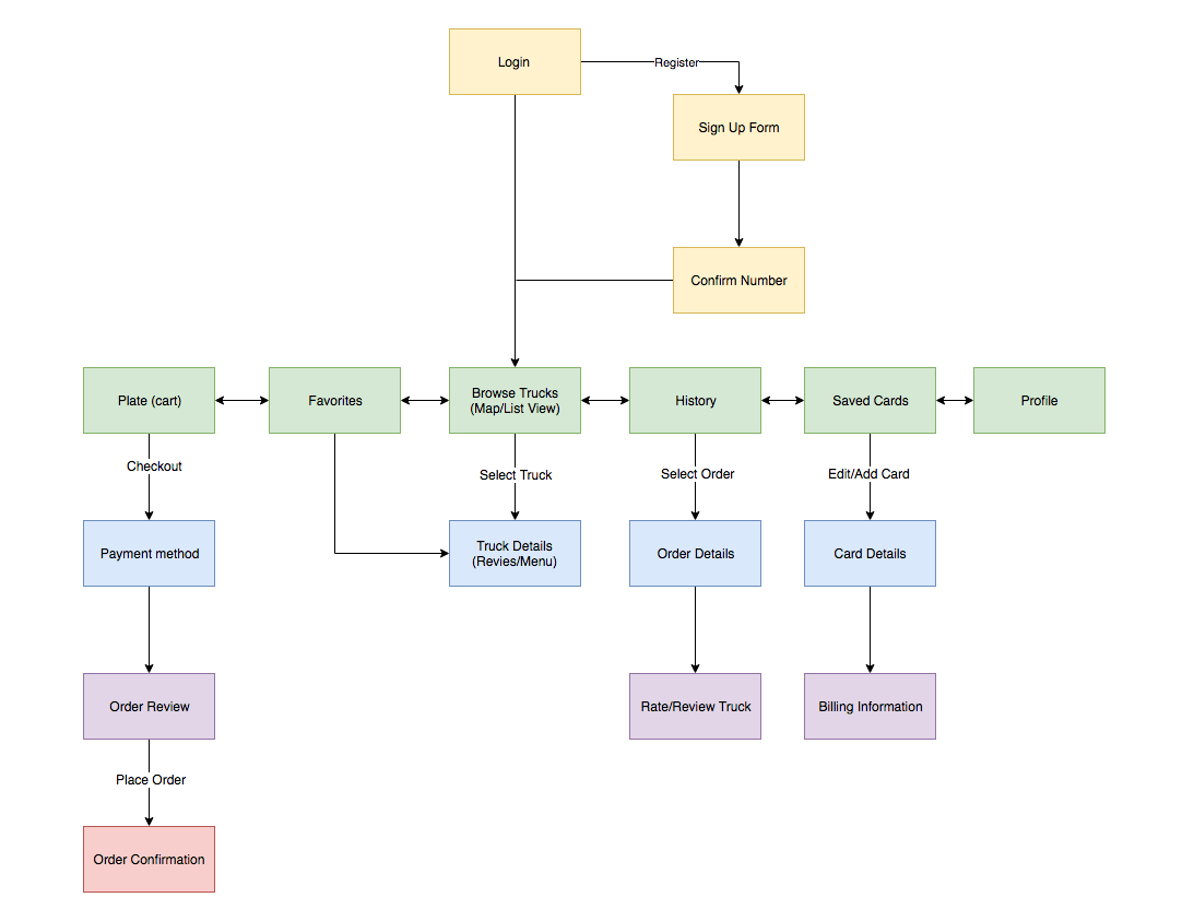
I began by conducting competitive analysis on existing food truck apps such as Truck Me and Roaming Hunger. I noted down certain features that other apps were doing well, particularly when it came to locating food trucks and selecting menu items. But I realized some apps had particularly long user flows to achieve tasks. When designing Paycrave, I made a conscious effort to make the user-flow simple and efficient.
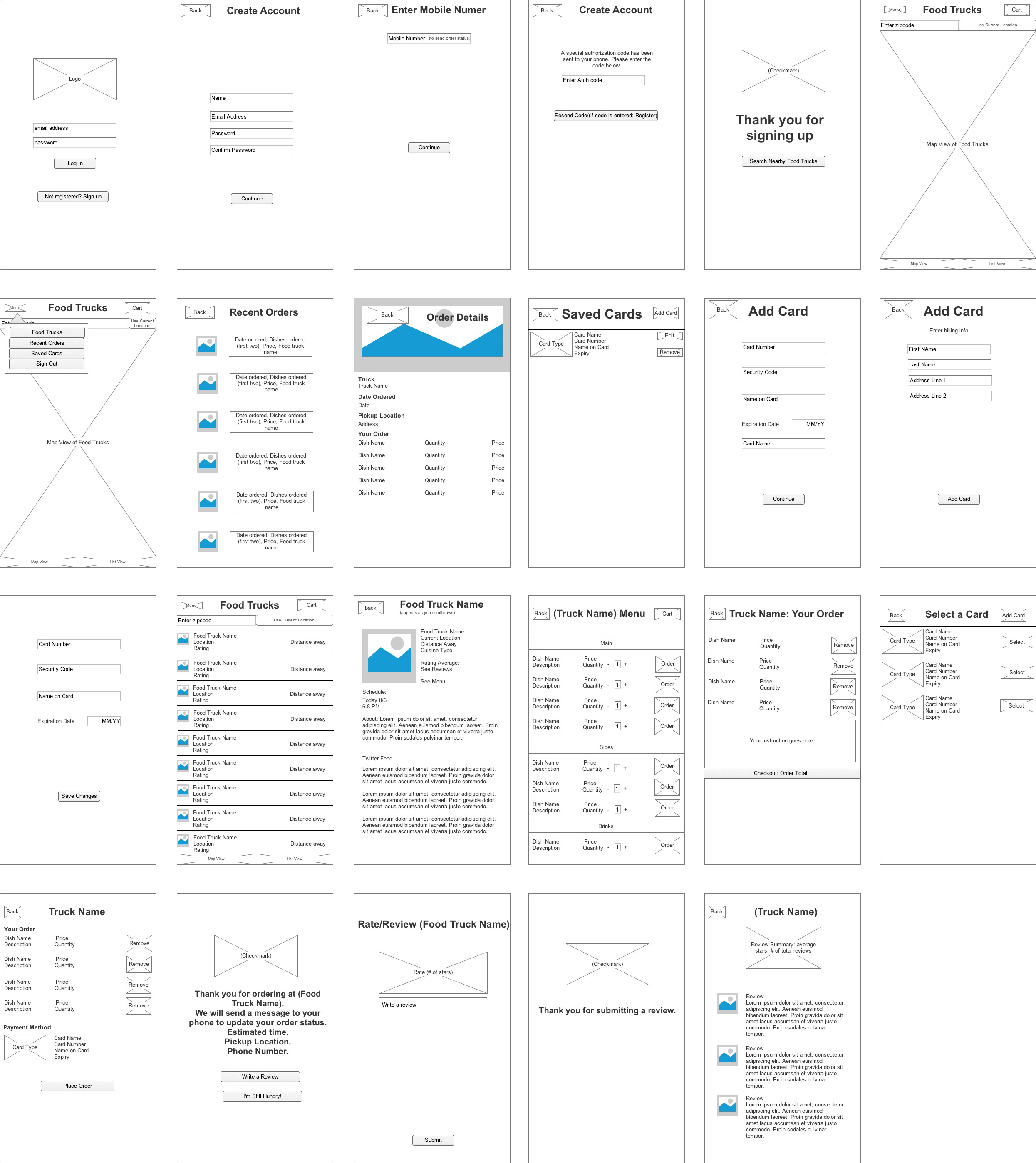
Using Apple’s iOS Human Interface Guidelines as a starting point, I familiarized myself with the iOS design process and began creating the wireframes. I went through a few iterations before moving on to high-fidelity mockups. The app is designed to have an intuitive and easy-to-use interface, where all the important features can be quickly accessed.
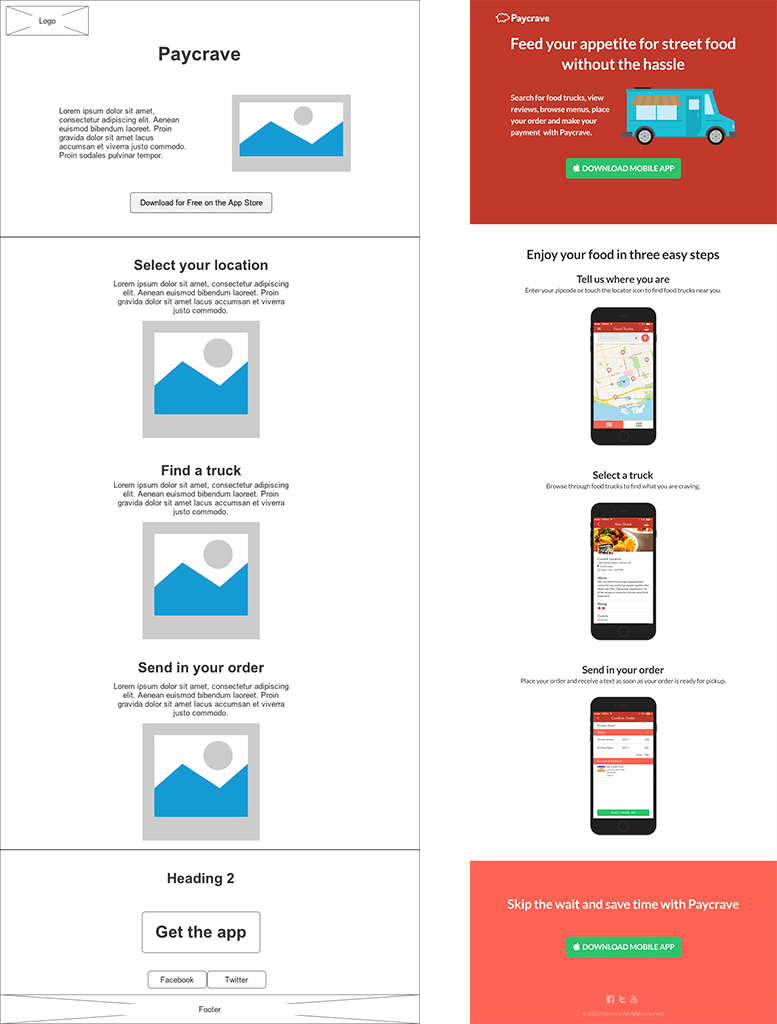
After designing the mobile app, I created a website to showcase the app. I designed a website that engages visitors with its animations and slideshow effect while providing them a sneak peak of what they can do with the app and how to use it.
I created scrolling animations using the Skrollr Javascript plugin. Because Skrollr has some glitches in mobile devices, I disabled it in smaller screen sizes for a seamless experience across different devices.
Redesign
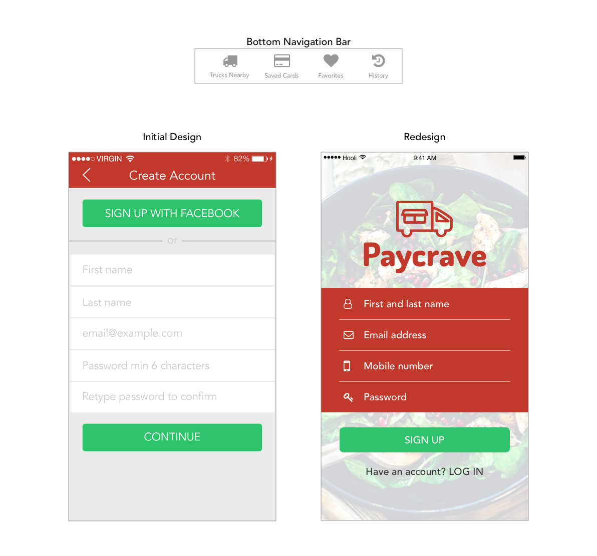
I used my first design to find any flaws and opportunities for improvement in the application. As a current student of the edX User Experience Design Micromasters program, I drew inspiration from their teachings of usability testing to create my own test for Paycrave. You can view the test script here. Below I will discuss the results from my usability testing and the steps I took to address the issues with my design.
The app could better serve user needs with a flatter navigation so that all parts of the app could be easily accessible. To do this I added a bottom navigation bar very similar to widely used apps like Facebook and Instagram. I also simplified the onboarding process by taking out unnecessary input fields and asking for the number upfront.
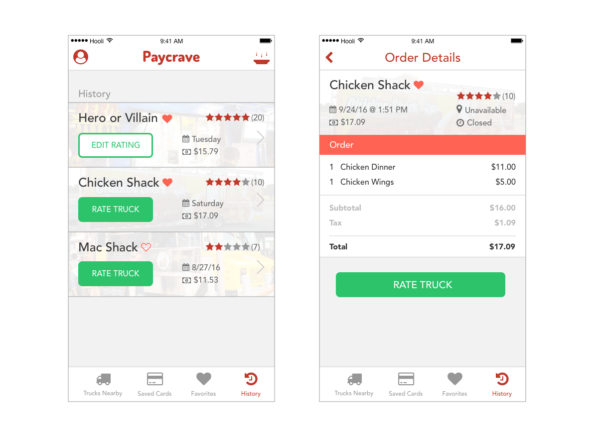
Initially, there was no way to rate a truck unless it was done immediately after placing an order. So, I decided to add a rating option directly on the list view of the order history page as well as in the order details.
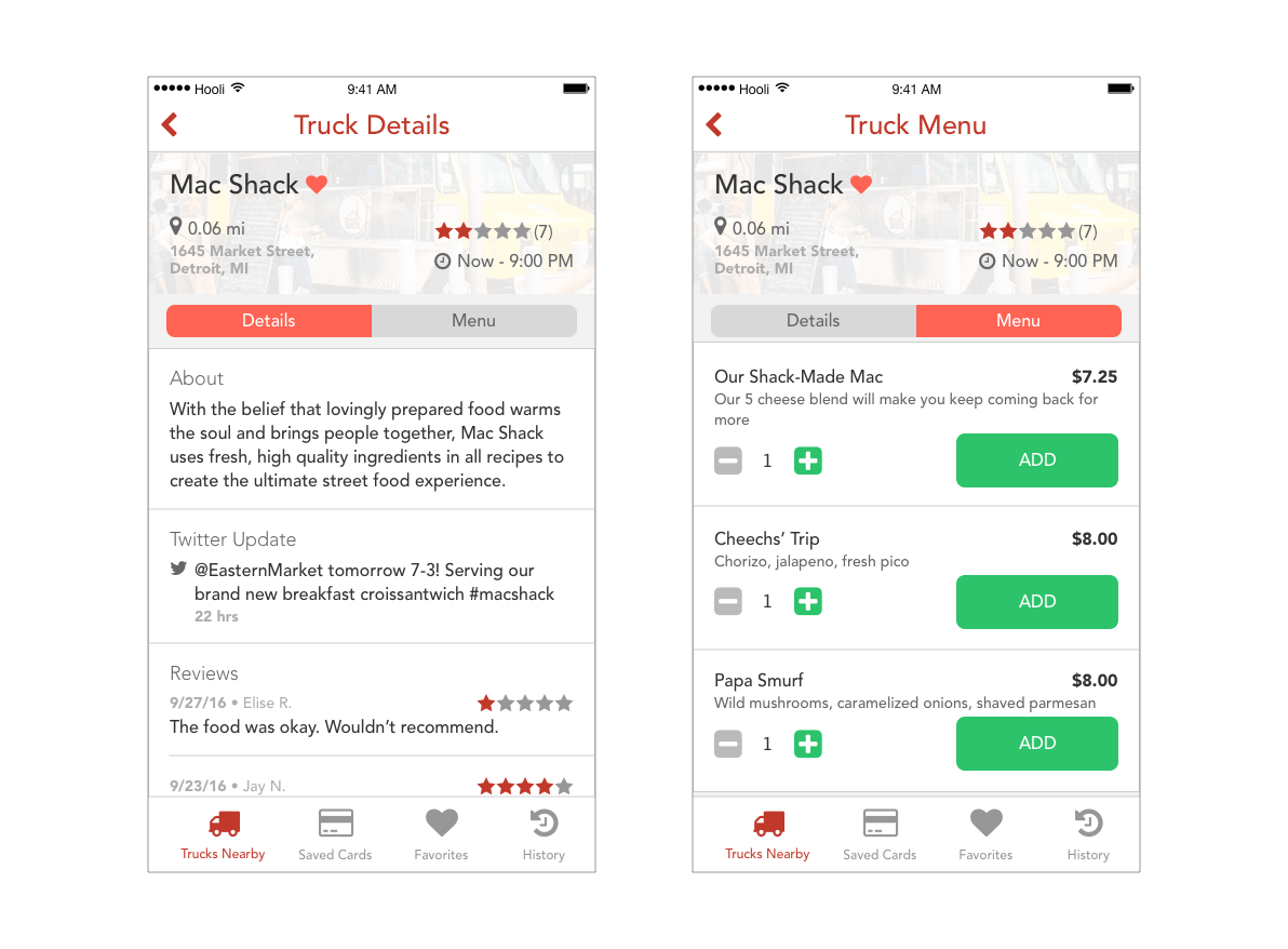
In the first design, the menu CTA of the truck was buried in the details page. In the redesign, I wanted to make it more apparent and created one page for all the truck information and two sticky tabs for details and the menu. Additionally, the user can go directly to the menu from the list/map views as most users won’t bother looking at the details if they are in a hurry.
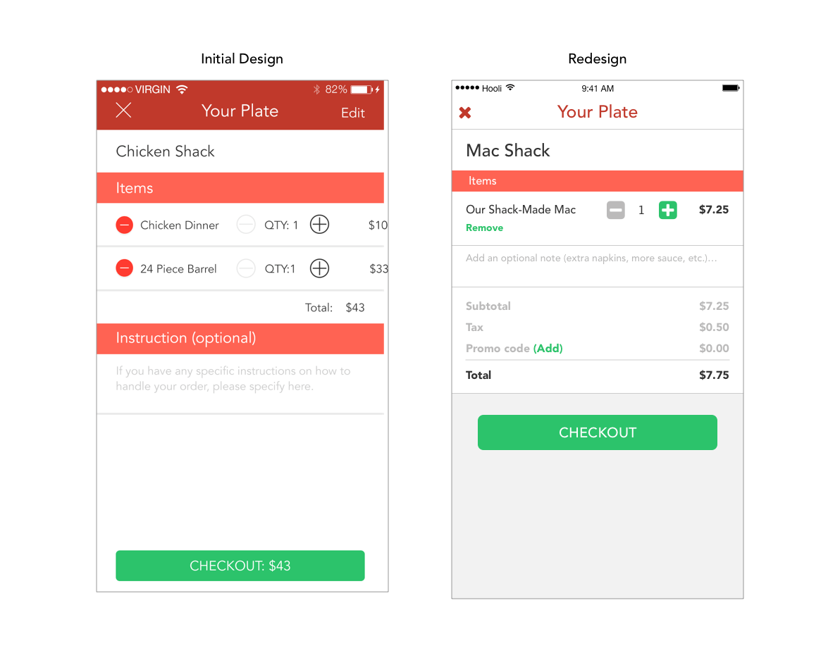
I wanted to make removing items in the plate easier. I did this by adding a remove button instead of hiding it with the slide action or making it a two-step process from the edit button.
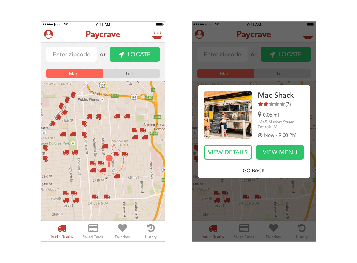
There wasn’t much functionality in the map view of the first design, and it served only as a visual reference. I decided to make it more useful by adding a truck detail popover for any truck that is tapped on. From the popover, the user can go directly to the details/menu.
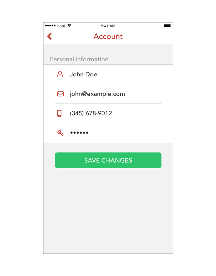
I also had to add a section that would allow users to change and update their account information, which was nonexistent in the first design.